Business context
We show the market problem, user friction, and commercial purpose behind the work.
Pick a lane, then we shape the strategy, interface, launch path, and growth layer around it.
View all services Launch-ready web architecture
We design and develop fast, responsive, conversion-focused websites using modern frontend systems, clean CMS structures, and polished interaction details.
Portfolio
A selected archive spanning storefront builds, product interfaces, automation systems, SEO, and growth campaigns.
Portfolio signals
Every case card carries enough narrative to help a visitor understand the problem, the thinking, the craft, and the outcome. That makes the portfolio useful before the detailed case studies are even opened.
We show the market problem, user friction, and commercial purpose behind the work.
Interface, content, motion, and component decisions are treated as one connected system.
Every case includes practical signals like performance, SEO, analytics, and conversion clarity.
Case-study anatomy
We do not judge portfolio work by screenshots alone. The strongest cases show why the problem matters, how the system is shaped, and what gets prepared for launch.
Each case starts with the user, offer, market signal, and friction we need to remove.
Typography, spacing, imagery, motion, and components are shaped into one premium language.
Navigation, flows, dashboard density, and content hierarchy make the experience easier to use.
Performance, analytics, SEO, and conversion paths make the work useful after it goes live.
Featured cases
We structured the storefront around clear collections, readable product sections, trust signals, responsive layouts, and a shopping path that keeps product discovery close to purchase intent.
View case study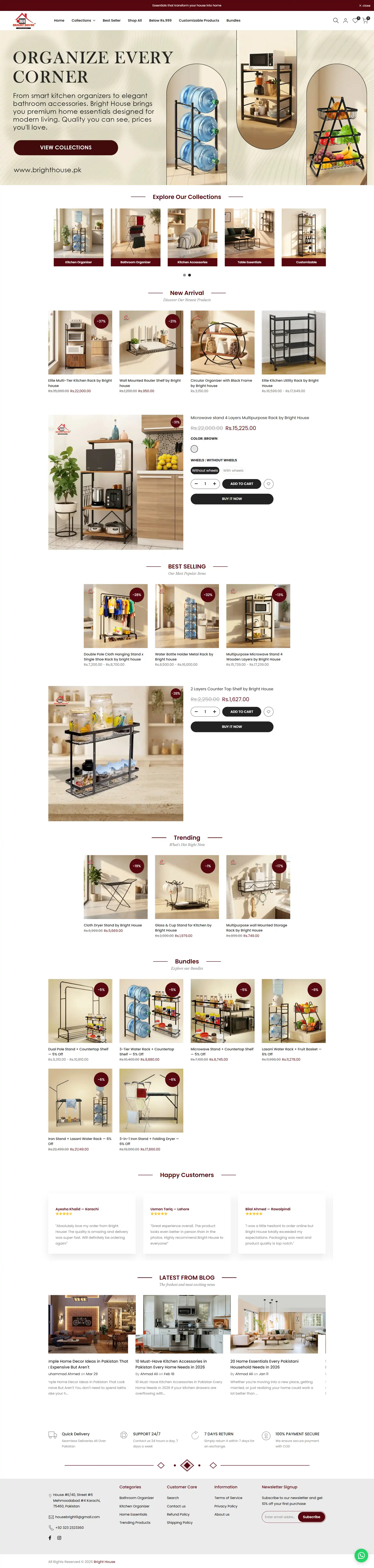 Hover to scroll
The store needed to present a wide range of home and lighting products without making visitors feel lost between categories, product details, and purchase actions.
 Hover to scroll
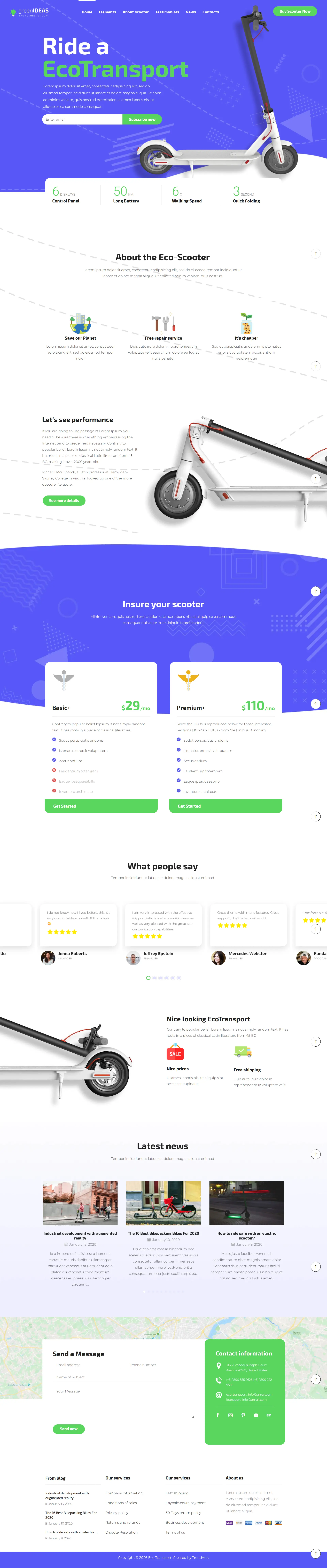
A single-product mobility offer needs to communicate performance, practicality, affordability, and trust without forcing visitors through disconnected pages or dense technical copy.
 Hover to scroll
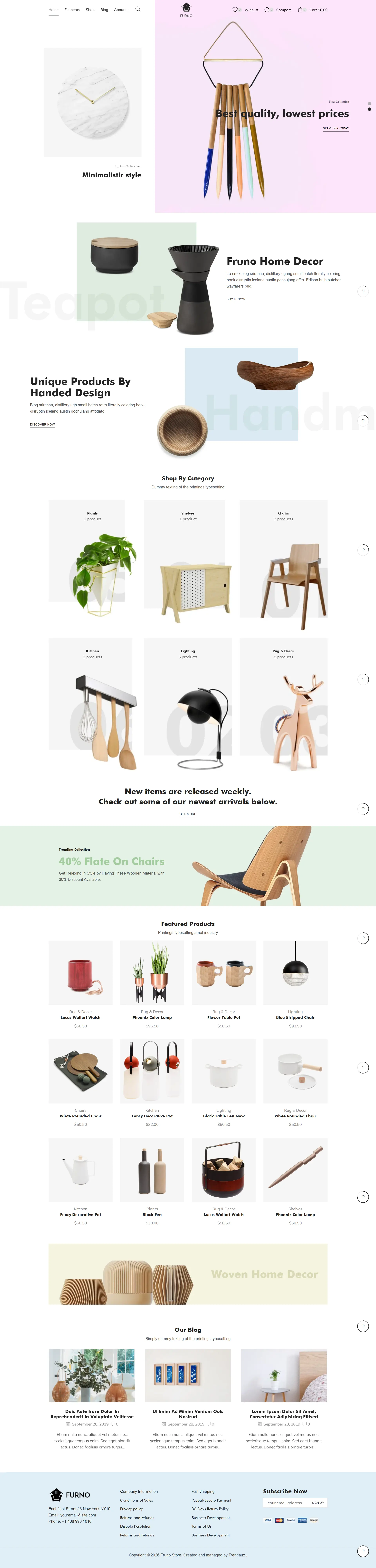
A home decor store needs to show variety without becoming a wall of products. Visitors should be able to understand the visual direction, browse useful categories, and discover featured items without losing the editorial feel.
 Hover to scroll
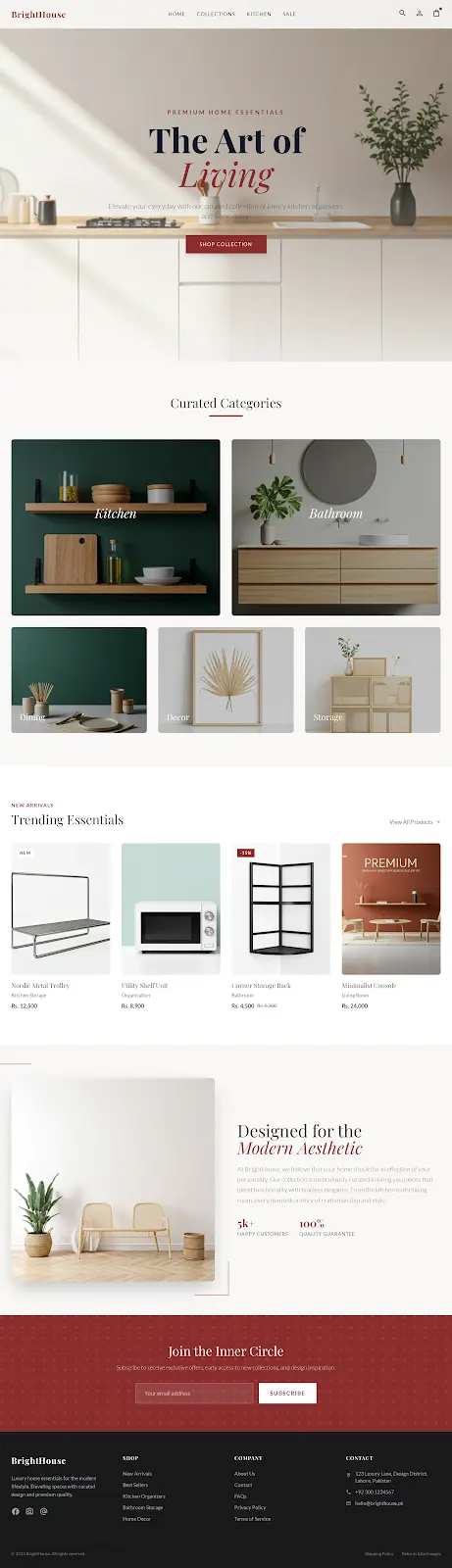
E-commerce screens often become crowded because products, categories, offers, trust points, and purchase actions all compete for attention at the same time.
 Hover to scroll
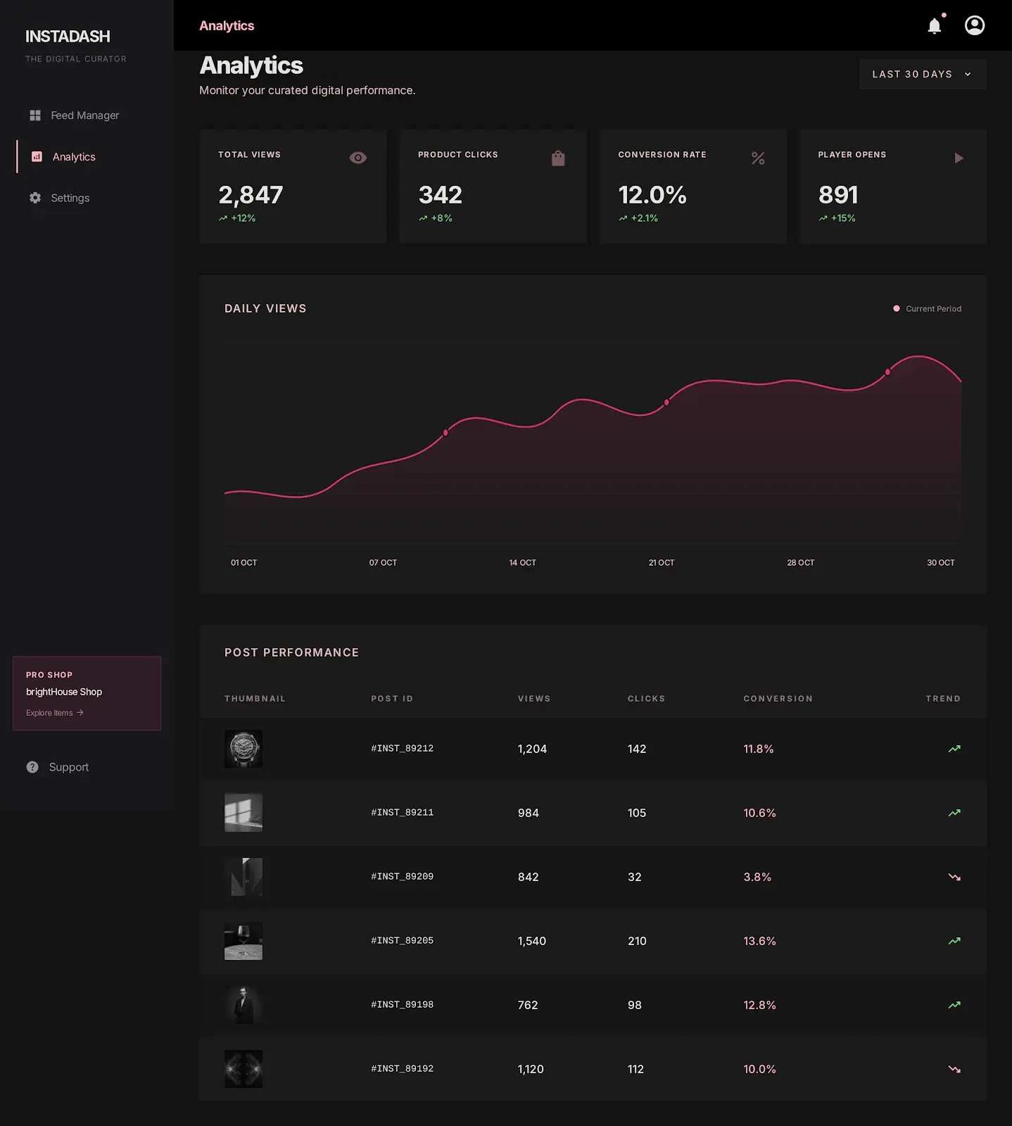
Dashboard products can quickly feel like data storage instead of decision support when feeds, charts, statuses, and actions compete without hierarchy.
 Hover to scroll
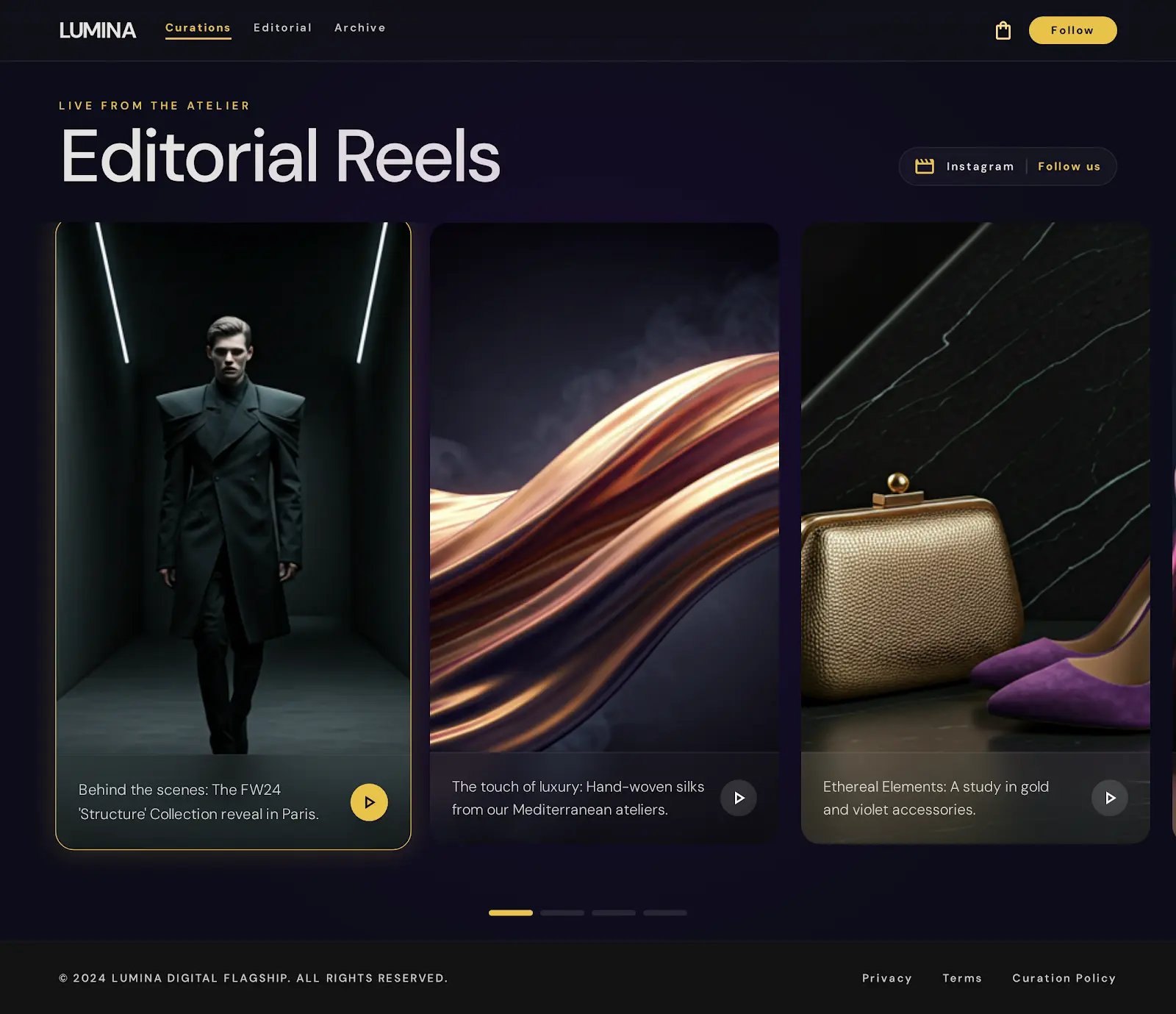
Luxury and content-led brands need interaction moments that feel cinematic without damaging clarity, performance, or the ability to move through content quickly.
 Hover to scroll
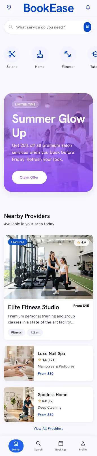
Service-booking products often lose users between discovery, provider comparison, service details, and final confirmation because each step feels disconnected.
 Hover to scroll
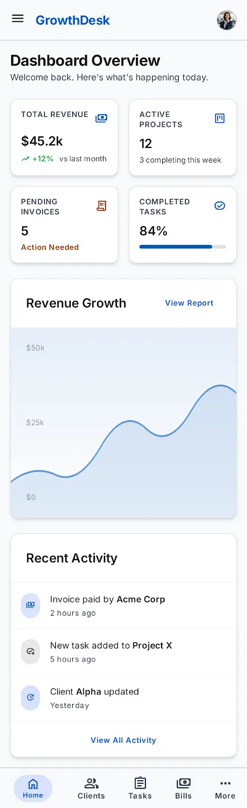
CRM products can become scattered when dashboards, invoices, records, and project workflows behave like separate tools rather than one operating system.
 Hover to scroll
Property apps need to carry a lot of detail while still helping users compare options, inspect a listing, and schedule a visit quickly.
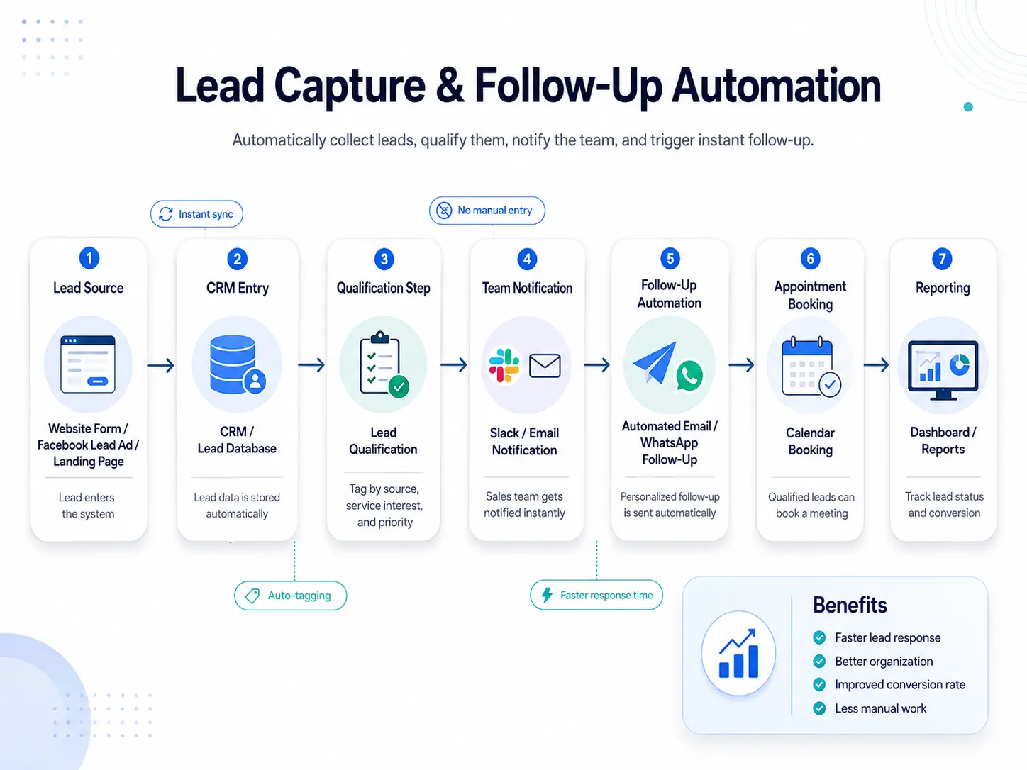 Hover to scroll
Leads often arrive from forms, ads, landing pages, and social channels faster than teams can organize, qualify, and respond to them consistently.
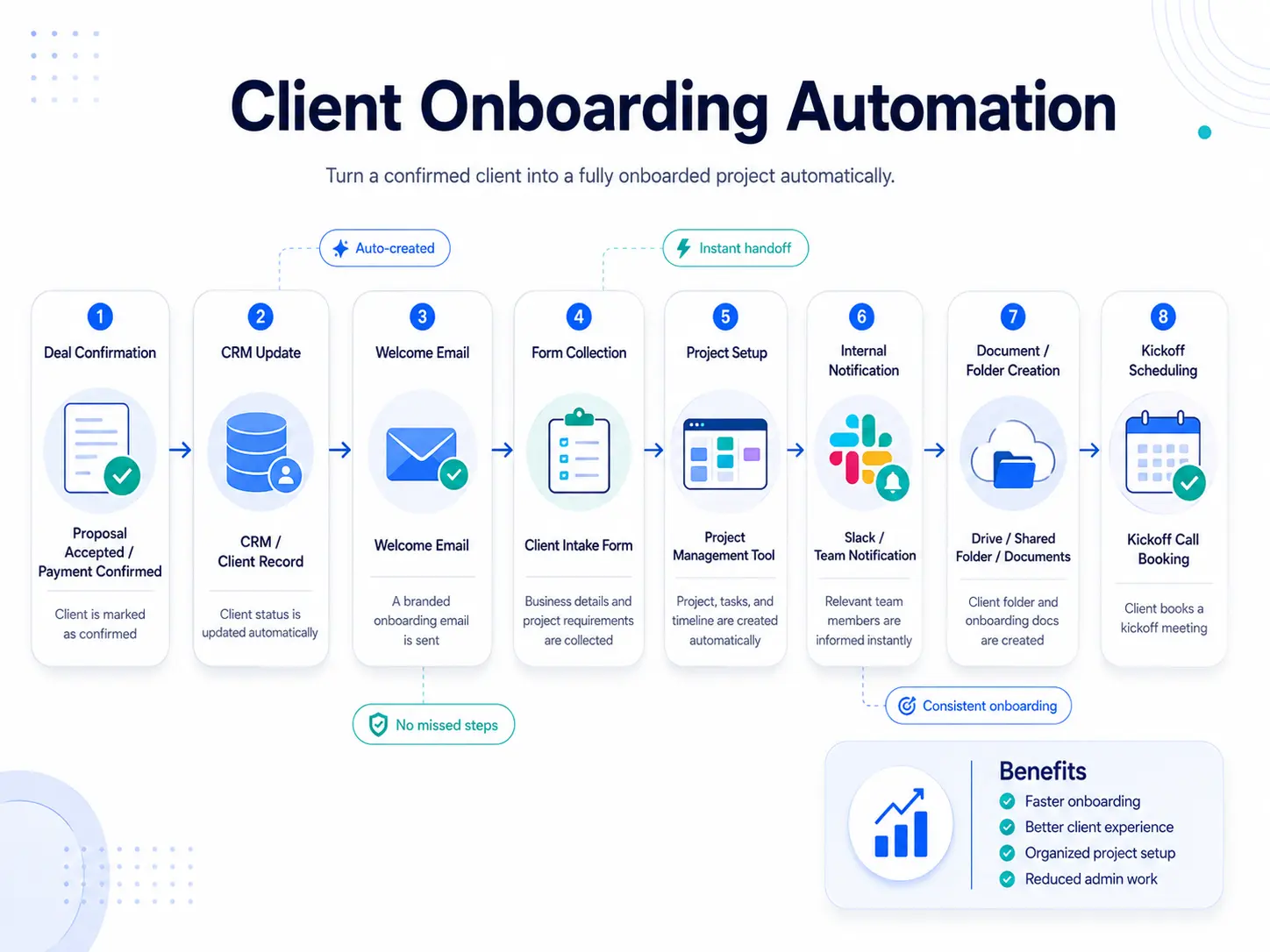 Hover to scroll
After a deal is confirmed, onboarding can become messy when CRM updates, welcome messages, forms, folders, team notifications, and kickoff calls are handled separately.
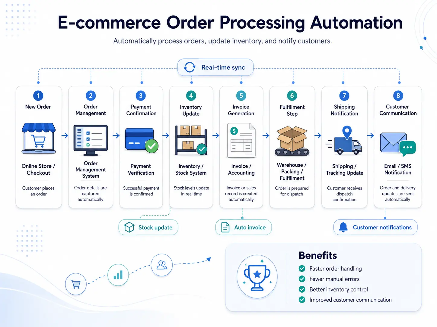 Hover to scroll
E-commerce teams lose time and accuracy when order details, inventory updates, invoice records, shipping notifications, and customer communication are managed in separate manual steps.
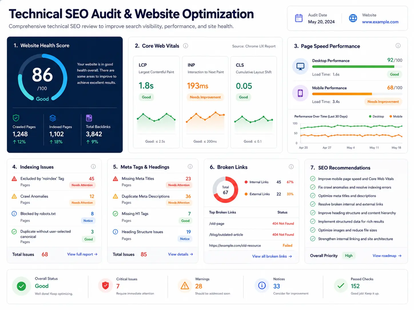 Hover to scroll
The site needed stronger search foundations before content growth could work. Crawl friction, inconsistent metadata, mobile performance, and unclear reporting made SEO progress harder to trust.
 Hover to scroll
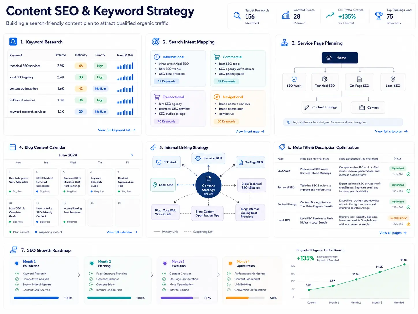
Search opportunities were scattered across keyword lists, blog ideas, service pages, and competitor gaps without a simple structure for what to publish first.
 Hover to scroll
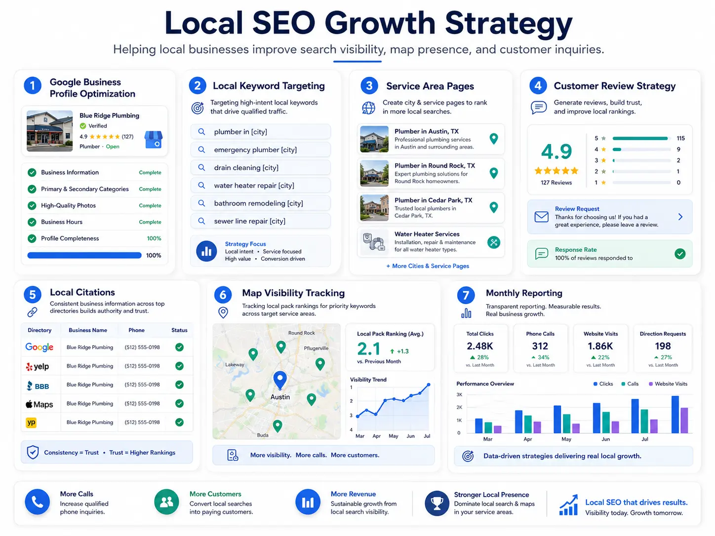
Local businesses often have scattered map signals, weak service-area content, inconsistent citations, and review gaps that stop them from converting nearby search demand.
 Hover to scroll
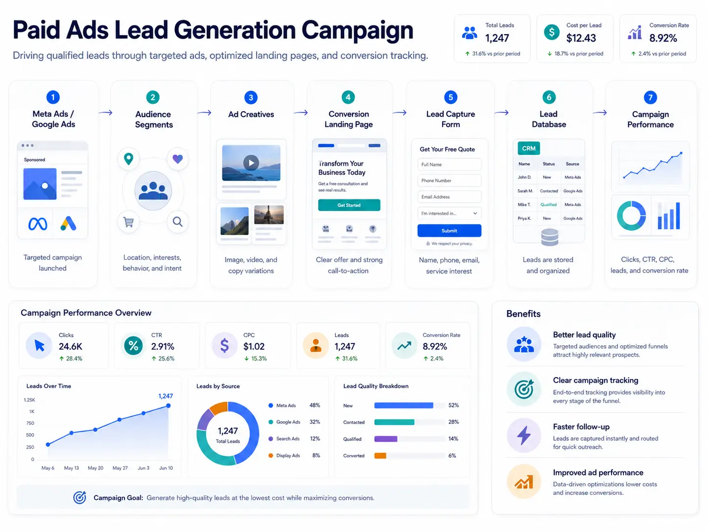
The offer needed a stronger lead-generation path. Traffic alone was not enough because the audience, ad creative, landing page, form, CRM handoff, and reporting all needed to work together.
 Hover to scroll
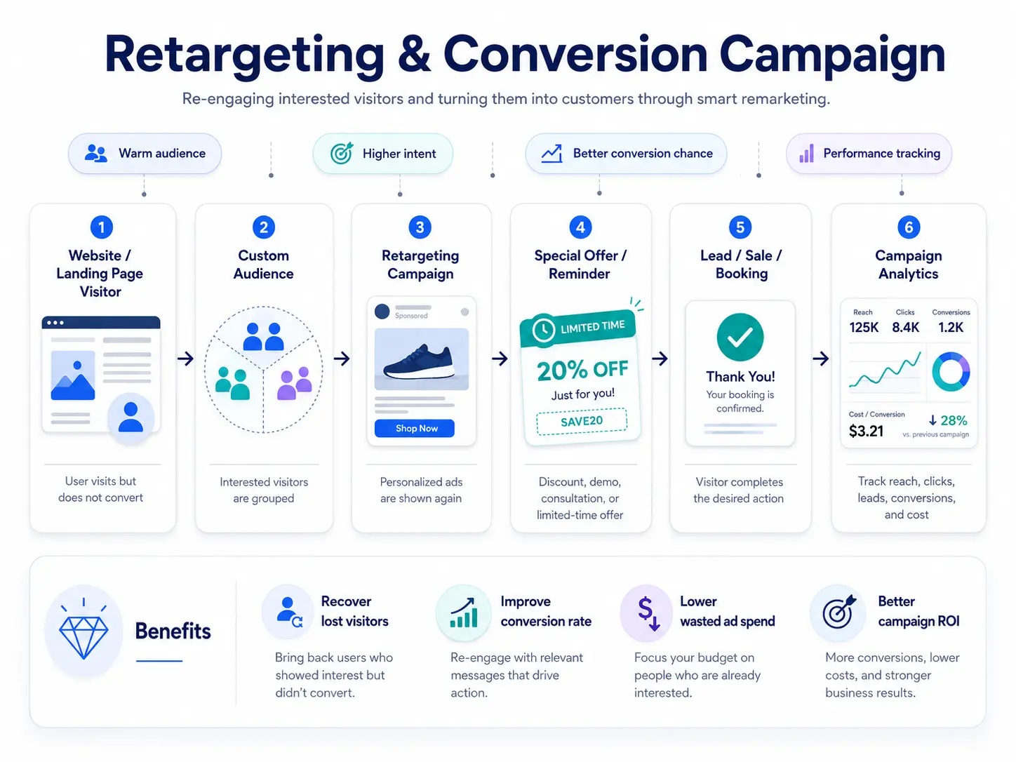
Warm visitors were leaving without taking action. The campaign needed to recover attention without wasting budget on people who had no proven interest.
 Hover to scroll
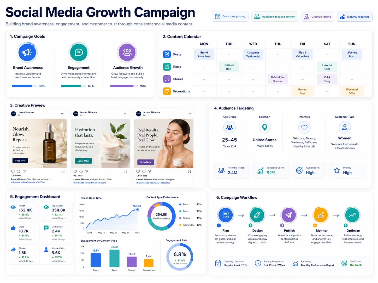
The brand needed a stronger social presence, but random posting would not create trust or measurable growth without goals, creative direction, audience targeting, and reporting.
Project index
Filter the archive by what your next project needs. Each card carries services, outcome, and enough context to connect the work back to business value.
Hover to scrollA live Shopify storefront for lighting and home decor, shaped around clear collection browsing, product discovery, and a polished responsive shopping experience.
Delivered a cleaner storefront experience with stronger collection paths, product presentation, mobile-friendly browsing, and a more credible shopping flow.
Hover to scrollA long-form WordPress experience that introduces an electric scooter through product benefits, performance details, pricing, social proof, editorial content, and a direct contact journey.
Prepared a complete promotional page system where the product story moves from the main offer into benefits, performance, pricing, reassurance, supporting content, and inquiry.
Hover to scrollA WooCommerce home decor experience that combines editorial merchandising, category discovery, promotional storytelling, featured products, and supporting content in one calm storefront system.
Organized a broad home decor catalog into a storefront that balances visual product discovery with practical category paths, promotional sections, and repeatable WooCommerce merchandising.
Hover to scrollA premium e-commerce interface project shaped around clearer product discovery, stronger collection movement, and a calmer path from browsing to buying.
Created a cleaner buying experience direction with stronger storefront hierarchy, more obvious browsing paths, and a product flow that keeps confidence close to action.
Hover to scrollA dashboard interface project for teams that need feed visibility, fast scanning, and clear action surfaces without making the product feel heavy.
Defined a dashboard system where live feed content, analytics, and action areas feel connected instead of scattered across separate operational views.
Hover to scrollA premium reels-style interface concept for brands that need content browsing to feel visual, editorial, and more tactile than a standard carousel.
Created an interaction direction where reels, campaigns, or product stories can be browsed as a premium visual sequence instead of a flat content list.
Hover to scrollA customer-facing booking product shaped around fast service discovery, clear provider inspection, and a confident booking confirmation flow.
Created a cleaner service journey where users can browse providers, inspect service details, and complete a booking without losing context.
Hover to scrollAn operational CRM product system for teams that need dashboards, management screens, invoices, and project movement in one clear workspace.
Defined a more connected CRM workspace where sales visibility, billing, records, and project movement can be handled from one product language.
Hover to scrollA real-estate app experience that helps users move from property discovery to listing inspection and scheduled visits with less friction.
Created a cleaner property browsing journey where listings, details, and scheduling feel like one guided decision path.
Hover to scrollAn automation workflow that collects new leads, stores them in the CRM, qualifies intent, alerts the team, and triggers follow-up without manual lead sorting.
Created a clearer lead-handling system where every inquiry can move from source to CRM, qualification, notification, follow-up, booking, and reporting with fewer manual gaps.
Hover to scrollA client onboarding system that turns a confirmed client into an organized project with intake details, shared folders, team alerts, and kickoff scheduling.
Defined a smoother onboarding path where confirmed clients receive the right instructions, the team gets notified, project spaces are created, and kickoff is scheduled without scattered admin work.
Hover to scrollAn e-commerce operations workflow that moves orders from checkout to inventory, invoice, fulfillment, shipping, and customer updates with fewer repeated admin steps.
Planned a cleaner order-processing system where payment, stock, fulfillment, invoice, shipping, and customer communication stay connected from the first order event.
Hover to scrollA technical SEO foundation project that turns crawl health, indexing, speed, metadata, schema, and reporting into one prioritized optimization roadmap.
Created a practical technical roadmap where crawl issues, indexing gaps, Core Web Vitals, metadata, broken links, and structured data are easier to fix and measure.
Hover to scrollA content SEO strategy that turns keywords, search intent, service-page planning, internal links, and content publishing into a structured growth system.
Built a clearer content growth map where high-intent keywords, service pages, supporting content, internal linking, and metadata optimization work together.
Hover to scrollA local SEO growth system that improves Google Business Profile strength, local keyword targeting, service-area pages, review signals, citations, and map visibility.
Structured a local visibility plan where profile completeness, city/service pages, citation consistency, reviews, map rankings, and reporting all support more qualified inquiries.
Hover to scrollA paid ads lead-generation campaign system designed to connect targeted traffic, creative testing, conversion pages, lead capture, CRM organization, and performance learning.
Created a clearer paid acquisition path where ad traffic, audience intent, creative variations, landing-page conversion, lead capture, and campaign performance are visible in one system.
Hover to scrollA retargeting campaign system that re-engages warm visitors with sharper offers, conversion reminders, booking paths, and performance reporting.
Built a warmer conversion path where interested visitors can be grouped, retargeted with relevant reminders, and brought back to a sale, booking, or lead action.
Hover to scrollA social media growth campaign system built around consistent posting, audience-focused creative, content calendar planning, engagement tracking, and monthly optimization.
Created a social growth plan where brand awareness, engagement, creative testing, audience targeting, content rhythm, and performance reporting stay connected.
What the work proves
Navigation, hierarchy, and content are shaped around the next user decision.
Motion and visuals support trust without turning the page into a performance.
Each case links the visual system to launch quality, growth, or operational clarity.
Positioning, audience paths, offer clarity, and the decisions that shape the project before design starts.
Interface systems, responsive build, motion language, content hierarchy, and launch-ready polish.
Performance signals, SEO structure, analytics moments, and conversion checkpoints after launch.
Client reviews
Client feedback expanded with the business context behind each result, from clearer websites to smoother internal workflows.
TrendAux turned our scattered service pages into a website that explains our offer clearly. New visitors now understand the packages before they message us.
A service brand needed visitors to understand packages, trust signals, and the next step without reading through scattered pages.
We rebuilt the service hierarchy around clearer package explanation, stronger proof moments, and a direct inquiry path.
Visitors can understand the offer faster and message with clearer intent.
The product pages, trust sections, and checkout flow feel much more intentional now. We finally have landing pages we can use for real campaigns.
The store needed stronger product pages and campaign-ready landing pages instead of sending traffic into a generic flow.
We improved the product structure, trust sections, and page rhythm so campaigns had a better destination.
The storefront became easier to use for traffic from ads and product discovery.
The visual direction finally felt like our brand. The pages became easier to read, easier to trust, and much more polished for serious clients.
The brand had enough value, but the digital presence did not feel polished enough for serious client conversations.
We reshaped the visual direction, page hierarchy, and interaction tone around a more premium client experience.
The website became easier to trust, easier to scan, and more aligned with the brand.
We needed a website partner who would keep things stable after launch. Updates, fixes, and new sections are handled with proper context now.
The practice needed website updates and new sections handled with context instead of one-off patchwork changes.
We treated support as a continuation of the system: stable updates, cleaner sections, and practical launch checks.
The site can keep improving after launch without losing consistency.
The copy finally sounds like our business instead of a template. They shaped the pages around client questions, proof, and a clearer booking path.
The studio needed copy and page structure that answered real client questions instead of sounding templated.
We shaped the content around proof, services, booking confidence, and a clearer path toward inquiry.
The pages now feel more specific, credible, and ready for serious prospects.
The dashboard work made our internal process easier to explain and easier to use. The interface feels built for repeat daily work, not just screenshots.
The internal product needed to feel easier to explain and use during repeated daily operations.
We organized the dashboard around clear actions, reusable patterns, and calmer operational visibility.
The product experience feels more usable for real team workflows, not just screenshots.
Service breadcrumbs
Have a project like these?