Private Dashboard UX Project
Feed Dashboard System
A dashboard interface project for teams that need feed visibility, fast scanning, and clear action surfaces without making the product feel heavy. Dashboard UX case created around faster scanning, clearer decisions, and cleaner action surfaces.
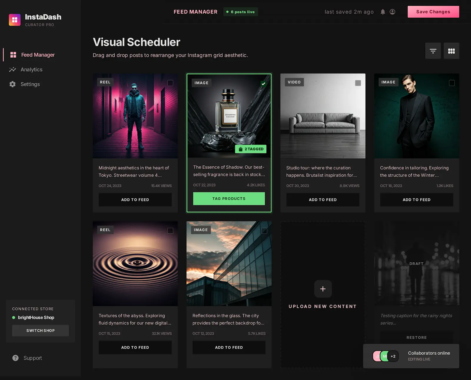
 Feed overview
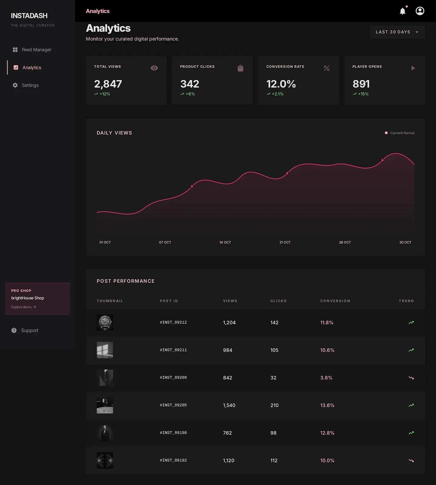
 Analytics surface
FormatPrivate Dashboard UX Project
IndustrySaaS, operations, and content teams
CategoryUI/UX Design
Year2026
Challenge
Define the problem before designing the surface.
Dashboard products can quickly feel like data storage instead of decision support when feeds, charts, statuses, and actions compete without hierarchy.
Solution
Shape the system around the next useful decision.
We separated scanning, inspection, and action zones so the user can understand what changed, what matters, and what to do next without losing context.
Outcome
Turn the work into a clear delivery direction.
Defined a dashboard system where live feed content, analytics, and action areas feel connected instead of scattered across separate operational views.
Interface decisions
The premium feel comes from decisions users can feel.
Separated the dashboard into scan, inspect, and act zones for faster comprehension.
Reduced visual noise by making data groups feel intentional rather than decorative.
Designed feed cards around status, signal, and next action instead of raw content only.
Kept the interface dark, focused, and operational so repeated daily use feels calm.
Built around
Selected projects only

