Private Retail UX Project
E-commerce Buying Flow
A premium e-commerce interface project shaped around clearer product discovery, stronger collection movement, and a calmer path from browsing to buying. Retail UX case created around cleaner shopping decisions and stronger storefront clarity.
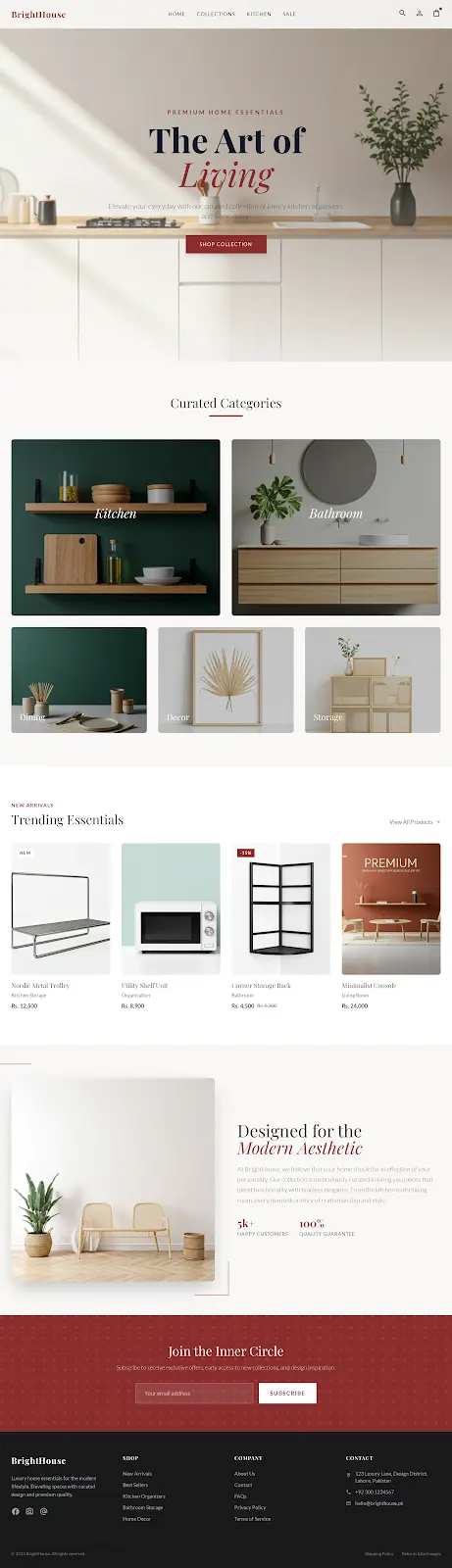 Homepage journey
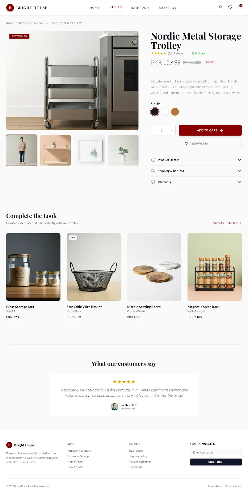 Product flow
FormatPrivate Retail UX Project
IndustryE-commerce and retail
CategoryUI/UX Design
Year2026
Challenge
Define the problem before designing the surface.
E-commerce screens often become crowded because products, categories, offers, trust points, and purchase actions all compete for attention at the same time.
Solution
Shape the system around the next useful decision.
We shaped the interface around a more deliberate visual hierarchy: clearer hero intent, collection movement, product proof, readable sections, and responsive screens that keep the shopping path calm.
Outcome
Turn the work into a clear delivery direction.
Created a cleaner buying experience direction with stronger storefront hierarchy, more obvious browsing paths, and a product flow that keeps confidence close to action.
Interface decisions
The premium feel comes from decisions users can feel.
Built the first screen around a clear retail promise instead of a crowded product wall.
Grouped browsing paths so category movement feels fast without hiding product depth.
Used larger spacing and calmer contrast to make product inspection feel premium.
Prepared the screens as a responsive direction that can move cleanly into development.
Built around
Selected projects only

