WhatsApp
Services

Build the system your next stage needs.

Pick a lane, then we shape the strategy, interface, launch path, and growth layer around it.

View all services
01Web Development02App Development03AI Automation04SEO05Digital Marketing06Content Creation07UI/UX Design
Launch-ready web architecture
Premium website systems

Web Development

We design and develop fast, responsive, conversion-focused websites using modern frontend systems, clean CMS structures, and polished interaction details.

Next.jsCMS IntegrationAPI DevelopmentPerformance
Explore Web

Fruno Home Decor

Fruno Home Decor WordPress Store

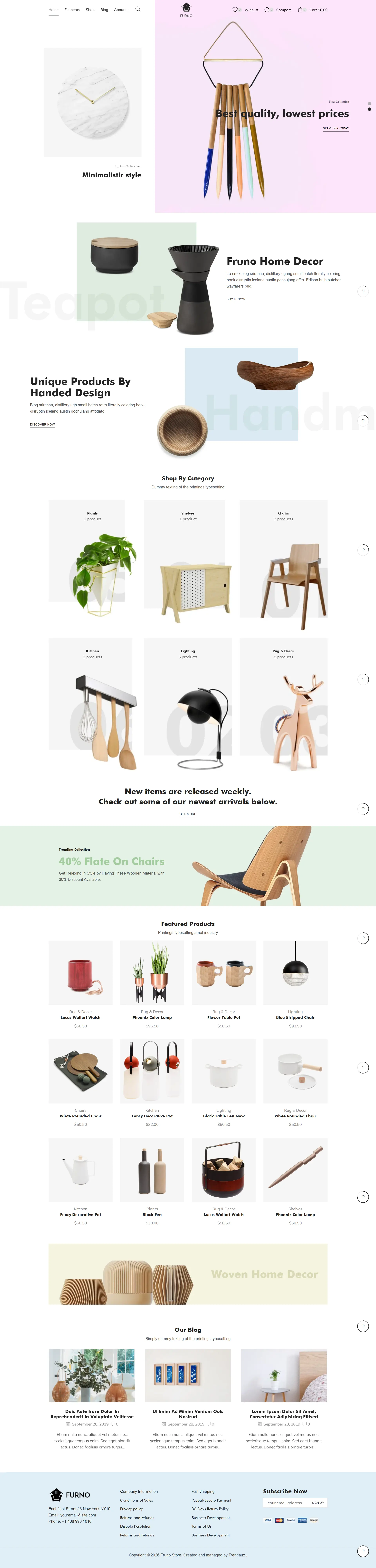
A WooCommerce home decor experience that combines editorial merchandising, category discovery, promotional storytelling, featured products, and supporting content in one calm storefront system. Built with the XStore WordPress theme and shaped around a clean home decor shopping experience.

Fruno Home Decor WordPress Store full-page previewFull-page preview
FormatFruno Home Decor
IndustryFurniture, lighting, and home accessories
CategoryE-commerce
Year2026

Challenge

Show product variety without creating a crowded catalog wall.

A home decor store needs to show variety without becoming a wall of products. Visitors should be able to understand the visual direction, browse useful categories, and discover featured items without losing the editorial feel.

Solution

Blend editorial merchandising with practical catalog movement.

We adapted the XStore structure into a spacious WooCommerce experience using strong product photography, alternating editorial sections, category groupings, promotional bands, featured-product grids, and supporting articles.

Outcome

Create a storefront that feels curated and remains shoppable.

Organized a broad home decor catalog into a storefront that balances visual product discovery with practical category paths, promotional sections, and repeatable WooCommerce merchandising.

Storefront story

Balancing editorial home inspiration with a practical WooCommerce catalog.

Home decor shopping is visual, but the experience still needs clear product and category logic. The page was shaped to feel like a curated collection while preserving the browsing structure visitors expect from an online store.

01Visual direction

Establish a calm editorial tone before showing volume.

The opening composition uses product photography and generous space to introduce the store without immediately surrounding the visitor with repetitive cards.

02Catalog movement

Alternate categories, features, and products.

Different merchandising formats break the catalog into useful moments, helping visitors scan, pause, and move into product groups without losing context.

03Promotion

Give offers a role without letting them dominate.

Promotional bands and featured-product sections are positioned as part of the browsing rhythm instead of competing with every product for the same level of attention.

04Content layer

Use supporting stories to extend product discovery.

Editorial content creates another path into materials, styling, and product use while giving the long storefront a more complete ending.

Experience highlights

A storefront that changes pace as the catalog unfolds.

The page alternates spacious editorial scenes with more practical merchandising blocks so visitors can move between inspiration and product inspection.

Editorial opening
01

A visual first screen gives the collection room to breathe.

The hero and introductory product compositions establish the store's tone before deeper category and catalog sections appear.

Merchandising rhythm
02

Featured products and categories arrive in varied formats.

Alternating layouts reduce repetition and help important collections feel distinct without changing the overall storefront language.

Supporting discovery
03

Articles and secondary sections carry the experience further.

The later page creates space for product context, handcrafted details, and supporting content instead of ending with another dense grid.

Implementation path

A merchandising system designed to stay flexible.

The implementation focused on repeatable WooCommerce sections that can support new categories and promotions without losing the editorial direction.

01

Define the visual hierarchy

Separate editorial moments, category navigation, product groups, promotions, and supporting content.

02

Map the catalog rhythm

Choose where the page should feel spacious and where shoppers need denser product comparison.

03

Adapt reusable WooCommerce blocks

Shape XStore sections that can be repeated without making the storefront feel templated.

04

Refine responsive merchandising

Protect image impact, readable product groups, and comfortable navigation across smaller screens.

WordPress build

Fruno Home Decor

Built with the XStore WordPress theme and shaped around a clean home decor shopping experience.

Web DevelopmentUI/UX DesignSEO
Commerce system
WooCommerce
Theme foundation
XStore
Catalog experience
Responsive
Built with XStore
Fruno Home Decor WordPress Store website previewExplore the page

Selected projects only

Your next digital experience should feel impossible to ignore and effortless to use.