Challenge
Make a broad lighting catalog feel easier to enter.
The store needed to present a wide range of home and lighting products without making visitors feel lost between categories, product details, and purchase actions.
Pick a lane, then we shape the strategy, interface, launch path, and growth layer around it.
View all services Launch-ready web architecture
We design and develop fast, responsive, conversion-focused websites using modern frontend systems, clean CMS structures, and polished interaction details.
Bright House
A live Shopify storefront for lighting and home decor, shaped around clear collection browsing, product discovery, and a polished responsive shopping experience. Built on Shopify and structured around clearer product discovery, credible presentation, and responsive shopping.
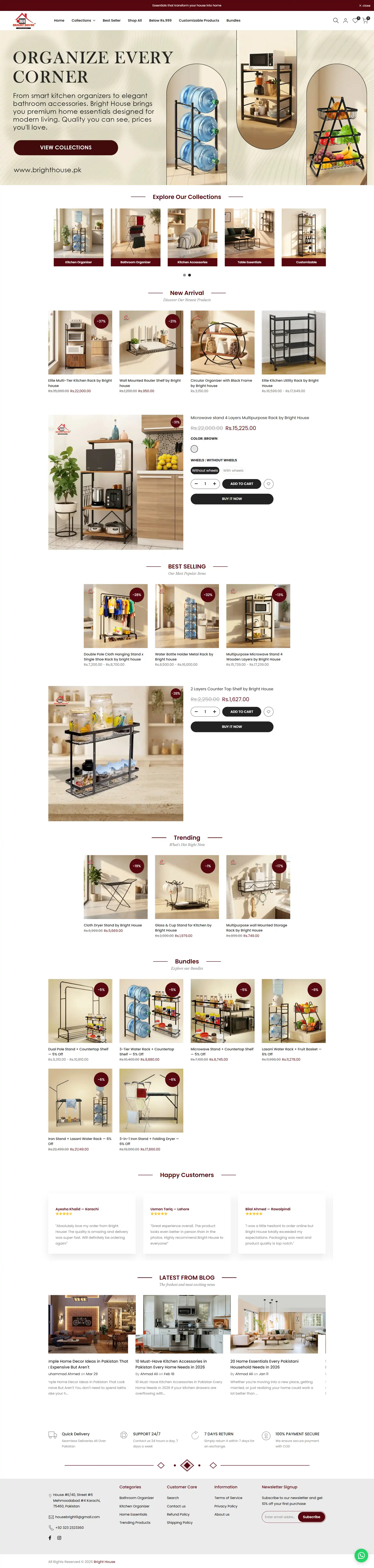 Full-page preview
Challenge
The store needed to present a wide range of home and lighting products without making visitors feel lost between categories, product details, and purchase actions.
Solution
We structured the storefront around clear collections, readable product sections, trust signals, responsive layouts, and a shopping path that keeps product discovery close to purchase intent.
Outcome
Delivered a cleaner storefront experience with stronger collection paths, product presentation, mobile-friendly browsing, and a more credible shopping flow.
Storefront story
Lighting shoppers often move between inspiration and practical comparison. The storefront needed to support both modes: help visitors imagine a product in their space, then make the category, detail, and buying path easy to follow.
The first screen had to establish the store quickly without forcing every category, offer, and product into the same visual moment.
Category paths, promotional sections, and product groupings were arranged so visitors could move from broad browsing into relevant fixtures and decor with less hesitation.
Clear product blocks, readable supporting content, and trust-led sections help shoppers understand what they are viewing before they reach a purchase action.
Spacing, content order, and tap-friendly actions were treated as part of the shopping system so mobile browsing feels intentional rather than compressed.
Experience highlights
The long page works as a sequence: establish the retail promise, open useful browsing paths, then support product confidence with detail and trust.
Entry pointThe opening view gives the store a recognizable direction and makes the next browsing action easier to understand.
Product discoveryThe middle of the experience balances category movement, featured products, and promotional moments without turning into a continuous product wall.
Decision supportLater sections reinforce credibility and keep useful information available as visitors move closer to a product decision.
Implementation path
The work was shaped around repeatable merchandising decisions so future products and collections can fit the same visual and navigational logic.
Identify the product groups, promotions, and trust information competing for attention.
Connect the homepage, collections, product discovery, and purchase intent into a readable sequence.
Create storefront blocks that can support new categories without breaking the established hierarchy.
Check content order, tap targets, image balance, and decision points across smaller screens.
Selected projects only
 impossible to ignore and
  effortless to use.